Monday, April 27, 2009

History: Container Corporation of America

Ralph Eckerstrom developed Container Corporation’s logo in the 1960s. He wanted the image if the isometric box with the 45-degree angle corners to advocate the systematic corporate identity. Eckerstrom stated that. “As a function of management, design must be an integrated part of overall company operation and directly related to the company’s business and sales activities. It must have continuity as a creative force. It must reflect total corporate character. Unless it meets these requirements, the company image it seeks will never coalesce into a unified whole, but will remain a mosaic of unrelated fragments.” In 1964, John Massey became the director of design for the Container Corporation. Systems design was broadly influenced by Massey and the International Typographic Style merged. In 1965, Container Corporation established the Center for Advanced Research in Design, a design studio that worked on advanced and experimental projects and received commissions from other organizations. 

Logo Design:Container Corporation of America

Design Process for recreating the logo


1. I collected the image for the logo and pasted onto Illustrator.


2. I created the box that was incorporated into the design.


3. I redesigned the "C" using shapes such as circles and rectangles. I used this same process to create the "A" as well.


4. After I recreated the letters, I moved them over into the square shape. At the end is my recreated logo!

Monday, April 20, 2009

Final Postcard


Here is the final design for my postcard for Saul Bass. 


Saul Bass is known for his use of type and simplistic design. I wanted to create a postcard that was simple with integrated details from various movie posters that he designed in the past. 

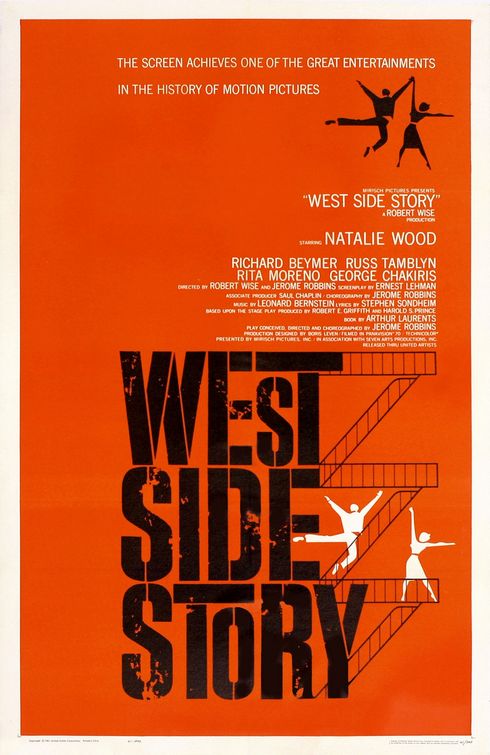
I began by researching movie posters, and picked out some of my favorite elements from several posters. I liked certain fonts, drawings and shapes from different posters. I noticed that Saul Bass' posters all had the same qualities in each movie poster, such as use of squares, reds/oranges, and misshaped letters. 

I printed out my favorite movie posters and traced my favorite elements. After I scanned my tracings, I edited the images in photoshop. I cut and pasted the images into a new composition of an old body with a new hand, along with SAUL BASS written across the body. This became the front of my postcard. 

For the back of the postcard, I integrated little squares into the background in tribute to Saul Bass, and used the same letters that I used in the front for his title name. 


Monday, April 13, 2009

"Symbolize and Summarize"

Saul Bass is best known for reducing an entire movie into a single image. He introduced broken typography into a realm where movie posters featured only paintings or actors to attract audiences. His simple lines and clean images created an innovative movement in graphic design during the 1960's, and famous movie director's recognized his work. Bass designed impressive movie posters for directors Otto Preminger, Stanely Kubrick, and Alfred Hitchcock. His design concept was to, "Symbolize and Summarize" in order to quickly attract people to a movie and its storyline. After his design style was overplayed, Bass began to design logos for AT&T, United Airlines,  and Quaker. 

I appreciate the simplicity/complexity of Bass' designs. He uses clean, simple lines that tell an entire story on one page. The simplicity illuminates a certain power to it, making the work easier to view either for a few seconds, or moments at a time. I plan to incorporate Bass' concept of symbol and simplicity into my postcard, as well as broken text and strong lines.

Here are some of my favorite designs by Saul Bass: